


Table of Contents
- What It Means to Curate a Home Aesthetic
- How to Find Your Home Design Style
- Home Decor Color Palette Ideas That Hold a Room Together
- How to Create a Cohesive Home Aesthetic Across Every Room
- Curated Home Decor Ideas: Texture, Art, and Meaningful Objects
- A Step-by-Step Process From Inspiration to Finished Room
- Budgeting, Sourcing, and Common Mistakes to Avoid
- Conclusion
- Frequently Asked Questions
Last Updated: October 20, 2026
What It Means to Curate a Home Aesthetic
A home aesthetic is the deliberate, consistent visual character of a living space, built from a defined color palette, a clear mix of furniture styles, and objects chosen for meaning rather than convenience. This guide from Theclothes.club walks through the full process, from first inspiration to a finished room.
Most homes drift rather than get designed: things arrive one at a time, each reasonable on its own, and the result is a room with no throughline. The Design Council's research on design value makes the broader case that considered design improves how people use and feel about a space, and homes are no exception.
Below, we'll show you how to move from vague "I like that" reactions to a cohesive home you can execute room by room, on a real budget.
How to Find Your Home Design Style
Your design style is the recurring visual pattern you are drawn to when nobody is influencing you. Find it by collecting before you decide: save everything that appeals to you for two weeks, then look for what repeats.
A common mistake is choosing a style label before gathering evidence. People pick "Japandi" or "mid-century" from a list, then discover half their saved images don't fit it. Work backwards instead.
Gather Inspiration and Build a Mood Board
Build a mood board from 20 to 30 saved images, then sort them into loose groups. The largest group is your real preference. Look for repeated signals:
- Color: which three to five tones keep appearing?
- Materials: wood, linen, metal, glass, boucle, leather?
- Light: bright and airy, or moody and layered?
Home Decor Color Palette Ideas That Hold a Room Together
A home decor color palette is the small set of tones you commit to before you buy anything, and the most reliable structure is the 60-30-10 split: roughly 60% of a room in a dominant neutral, 30% in a secondary tone, and 10% in an accent. That ratio gives you contrast without chaos, but the colors themselves come from working outward from what you cannot change.
Start With the Fixed Elements
Every room has elements you are unlikely to alter: flooring, wall color, large built-ins, kitchen cabinetry, and the dominant light direction.
If the fixed elements are neutral, you have freedom. If they are strongly colored, a terracotta tile floor, a navy kitchen, treat that color as your secondary or accent and build around it rather than trying to neutralize it.
Four Palette Structures That Work in Most Homes
| Palette | Dominant (60%) | Secondary (30%) | Accent (10%) | Best For |
|---|---|---|---|---|
| Warm neutral | Oat, cream | Olive, clay | Brass, rust | Relaxed, lived-in rooms |
| Cool tailored | Soft grey | Navy, charcoal | Mustard, chrome | Structured, modern spaces |
| Earthy layered | Sand | Terracotta, brown | Deep green | Vintage-leaning interiors |
| Bright and airy | White | Pale wood, sage | Black, cobalt | Small or low-light rooms |
Treat these as starting points, not prescriptions. Pick one row, then swap a single tone to match your fixed elements: with warm oak floors, the cool tailored row becomes soft greige, navy, and mustard rather than cool grey. The structure holds; the tones flex.
Test the Palette Before You Commit
Before buying paint or furniture, build a physical sample board: a paint chip for each tone, a fabric swatch for the secondary, and one small object in the accent.
A second test: photograph the sample board next to the room's fixed elements and view it in black and white. If the values (light versus dark) are too similar, the room will read flat regardless of hue.
Carry the Palette Across the Whole Home
Hold the palette across the whole home, not just one room. Carry one or two tones from the living room into the hallway and bedroom so the eye reads continuity. A practical rule: the dominant neutral can change room to room (a warmer cream in the bedroom, a cooler off-white in the kitchen), but the secondary and accent should repeat, that repetition is what makes separate rooms read as one home.
How to Create a Cohesive Home Aesthetic Across Every Room
To create a cohesive home aesthetic, repeat a small set of anchors across every room: two or three colors, one or two material families, and a consistent approach to metal finishes.
Pick your anchors and write them down. Ours would look like: warm oak, off-white walls, black metal hardware, natural linen. Then test each new purchase against that list before buying.
Mixing Styles and Furniture That Works Together
Mixing styles keeps a home from looking like a showroom, but it needs rules. The most useful one: keep 70% of a room in one dominant style and let the remaining 30% pull against it.
Balance visual weight too. A heavy, dark piece needs a lighter counterpoint nearby, or the room tips. Scale matters just as much: a small rug under a large sofa makes the whole arrangement feel unmoored, so measure before you buy.
Curated Home Decor Ideas: Texture, Art, and Meaningful Objects
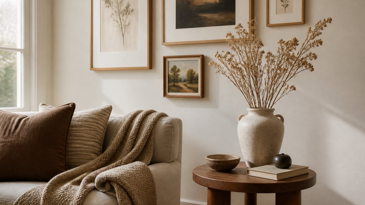
Curated home decor ideas share one trait: they add texture and personal story rather than filling empty space. A room built only from flat, smooth surfaces feels sterile no matter how good the palette is.
A Repeatable Test for Whether a Piece Belongs
Before any decorative purchase or keep decision, run the piece through five questions. If it fails two or more, it doesn't come home.
- Function. Does it do something, hold, light, soften, cover, display, or is it purely filler? Filler is the fastest route to clutter.
- Fit. Does it match your written anchors (palette, material families, metal finish) and the room's scale? A piece can be beautiful and still be the wrong size for the wall or the wrong tone for the palette.
- Color and material. Does it introduce a tone or material already in your palette, or does it start a new one? One new accent is fine; a new material family per object is how rooms lose cohesion.
- Meaning. Can you say in one sentence why it is here, a trip, a person, a maker, a material you love? If the only answer is "it was on sale," that is a signal.
- Maintenance. Can you realistically care for it? A pale linen sofa or a high-maintenance plant is a commitment, not a decoration.
This framework is the practical version of the pause-before-purchase habit, and it works equally well when editing what you already own.
Texture: Layer Deliberately, Not Randomly
Layer materials so each surface contrasts with its neighbor: a smooth leather ottoman with a chunky knit throw, a glass coffee table with a rough ceramic bowl, a glossy lacquer tray against a matte plaster wall. Contrast in texture does the work pattern often gets asked to do, and it is more forgiving of a tight palette. Aim for at least three distinct textures in any seating area, one soft (textile), one hard (wood, stone, metal), and one in between (leather, ceramic, woven fiber).
Art and Objects: Buy Slowly, Edit Ruthlessly
For artwork and decorative objects, apply the same five-question test. A gallery wall of prints chosen over years beats a set bought in one afternoon, because the meaning test is easier to pass when pieces arrive one at a time.
Editing matters as much as acquiring. Removing two objects often improves a shelf more than adding a third. A practical editing pass: clear a surface completely, then put back only the pieces that pass the five-question test, and leave at least a third of the surface empty.
A Step-by-Step Process From Inspiration to Finished Room
Here is the repeatable method we recommend, from blank slate to finished room:
- Define the brief. Write one sentence describing how the room should feel and what it must do.
- Collect and sort. Save 20 to 30 images, group them, and identify your repeating signals.
- Lock the palette. Choose dominant, secondary, and accent tones, and note your fixed elements.
- Plan the layout. Measure the room and mark furniture placement and the focal point before buying anything.
- Set the budget and priority order. List purchases by impact, not by wishlist order.
- Buy in layers. Start with the largest pieces, then rugs and lighting, then textiles and accessories.
- Live with it, then edit. Give the room a few weeks, then remove what isn't working.
Room-by-Room Curation and Real-Life Constraints
Apply the same anchors differently per room. Living rooms carry the strongest style statement; bedrooms should stay calmer; hallways need one repeated tone to link the home together.
Real constraints shape the plan. In a rental, treat wall color and flooring as fixed and put your budget into lighting, textiles, and freestanding furniture you can take with you. In a small space, keep the palette tight, use one large rug rather than several small ones, and choose furniture with visible legs so floor area stays readable.
Budgeting, Sourcing, and Common Mistakes to Avoid
Budget by impact, not by room size. The pieces you touch and look at daily, seating, lighting, and rugs, deserve the largest share.
Sourcing is where most budgets leak. A common mistake is buying trend pieces at full price early, then finding they fight the anchor palette.
Three mistakes to fix an incohesive room quickly:
- Too many focal points. One per room. Everything else supports it.
- Ignoring scale. Oversized art on a small wall, or a tiny rug under a big sofa, breaks visual balance.
- No editing pass. Clutter reads as noise. Remove until the room breathes.
At Theclothes.club, our home and living range is built for exactly this kind of gradual curation: a curated selection of home goods and lifestyle pieces, with free membership for exclusive deals and new arrivals.
Conclusion
Curating a home aesthetic is a skill, not a talent, and the hardest part is holding a consistent direction across months of small purchases. Start with one room, write down your anchors, and buy in layers.
If you want a simpler way to source the finishing pieces, Theclothes.club brings home and living, fashion, beauty, and everyday essentials into one curated store, with free membership for exclusive deals and new arrivals.
Frequently Asked Questions
What is the 3-5-7 rule in decorating?
The 3-5-7 rule is a styling guideline for arranging accessories in odd-numbered groups: three small objects, five medium ones, or seven tiny ones. Odd numbers create visual balance because the eye doesn't pair items into symmetrical rows. Try grouping three candles of different heights on a tray, or five books with a small sculpture on a shelf. Vary height and texture within the group so it reads as collected rather than lined up. It's a starting point, not a strict law, so adjust until the arrangement feels right for your home aesthetic.
How do I figure out my home aesthetic?
Start by saving 20 to 30 images of rooms you love, then look for repeats. Note the colors, materials, and moods that show up again and again. Ask yourself whether those rooms feel bright and airy, relaxed, tailored, or vintage. Your home aesthetic usually sits where your favorite images overlap. Test the direction with one small purchase, like a cushion or a print, before committing to larger furniture. The goal is a style you can describe in a sentence, not a label borrowed from a trend report.
What does it mean to curate a home?
Curating a home means choosing each piece on purpose rather than filling space by default. Every item, from furniture to accessories, earns its place because it supports your chosen home aesthetic or tells part of your personal story. In practice, that means editing as much as adding: decluttering what doesn't fit, then buying fewer but better pieces that work together. A curated home still looks lived-in and functional. The difference is that the thoughtful selection shows, and the result feels cohesive rather than accidental.
How can I make my home look curated on a budget?
Prioritize the pieces people notice first: lighting, textiles, and wall art. A new lampshade, a textured throw, or a set of framed prints can shift a room's mood for a modest spend. Shop secondhand for furniture with character, and mix in affordable finds from a curated marketplace rather than buying a full matching set at once. Repaint one wall or rearrange existing furniture before buying anything new. Buying slowly and only when a piece fits your palette keeps costs down and prevents clutter.
How do I choose a color palette for my home?
Anchor the palette in something you can't easily change, like flooring or a sofa, then build around it. A common approach is the 70/30 rule: roughly 70 percent of a room in a dominant neutral, 30 percent in a secondary color, with a small accent in a third. Pull two or three home decor color palette ideas from your mood board and test them with paint swatches or fabric samples in the actual light of the room before committing.
How do you make a home feel cohesive?
Repeat a few elements across rooms: two or three colors, one or two wood tones, and a consistent metal finish for hardware and frames. Keep scale in mind so furniture suits each room's size, and give every space a clear focal point. Layering texture through rugs, throws, and cushions ties different rooms together without making them identical. Cohesion comes from these shared threads, not from matching everything, so leave room for each room to have its own function and personality.


